Venyou
Project Overview
The Product
The Venyou app are for customers that want to quickly place and pick up an order at their venue. Venyou also offers top deals and hot items that users can browse through. The app’s target audience are teenagers and early college students that attend concerts or events regularly.
Project duration
June 2022 - October 2022
The Problem
Users having issues ordering items at a busy and crowded venue.
The Goal
Designing an app for users to order concession stand items efficiently. Giving them the ability to track their order and pick up their concession items.
My Role
UX Designer and Researcher designing the app and experience for Venyou from conception to delivery.
Responsibilities
Conducting user research, paper and digital wireframing, low and hi fidelity prototyping, conducting usability testing, iterating on designs, and accounting for the user.
Understanding the User
- User Research
- Personas
- Problem Statements
- User Journey Maps
User Research - Summary
I conducted interviews and created empathy maps to understand users that I’m designing for and their needs. A primary user group that I identified with research was working college students who want to order items at a concert/venue.
This user group confirmed assumptions of music venue customers, but research also revealed that not only ordering was the main factor. Other user problems included language barriers, interests, or financial problems that can make it difficult to order items at a venue.
User Research - Pain Points
1
Financial
Working young adults aren’t always financially stable to purchase full priced items at a venue.
2
Accessibility
Platforms for ordering food are not always equipped with assistive technologies like language.
3
Inventory
Not having all the items listed within the app to give the user the ability to purchase what they want.
4
Easibility
Having to fight crowds of people to order something simple through an app.
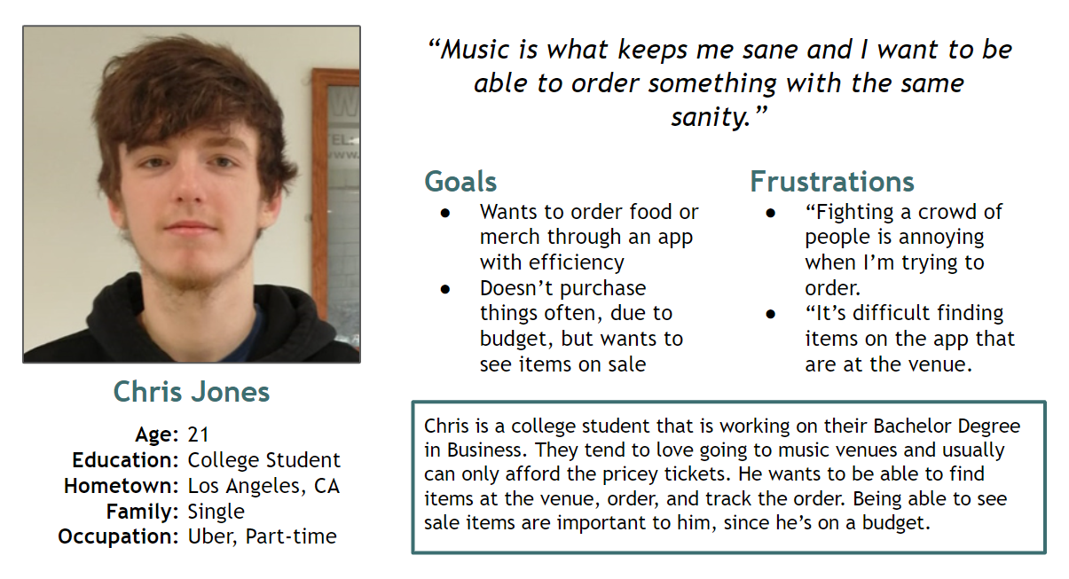
Personas - Chris
Problem Statement
Chris is a busy College student who needs to order food quickly, at the venue he’s currently at because he wants to get back to the music he loves.
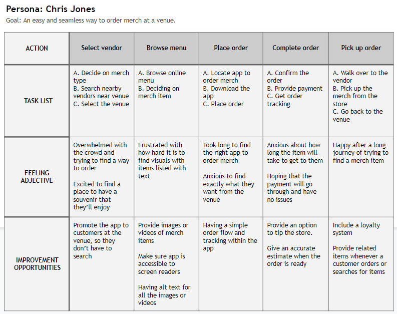
User Journey Map
Creating the journey for Chris allowed us to understand how useful Venyou app can be for a user like him.
Starting the Design
- Paper Wireframes
- Digital Wireframes
- Low-fidelity Prototype
- Usability Studies
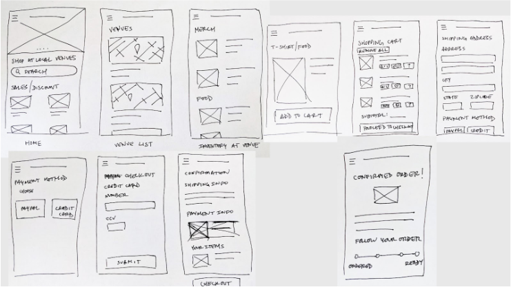
Paper Wireframes
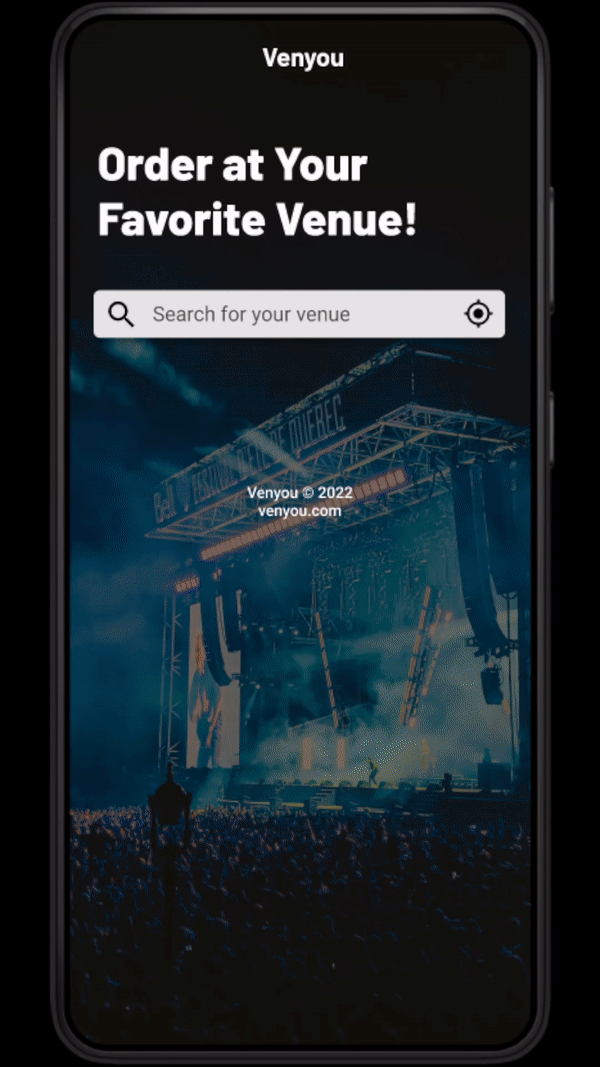
Crafted many paper wireframes to take into account for the user’s wants and pain points. For the home screen, I’ve prioritized having discounted items for our audience.
Digital Wireframes
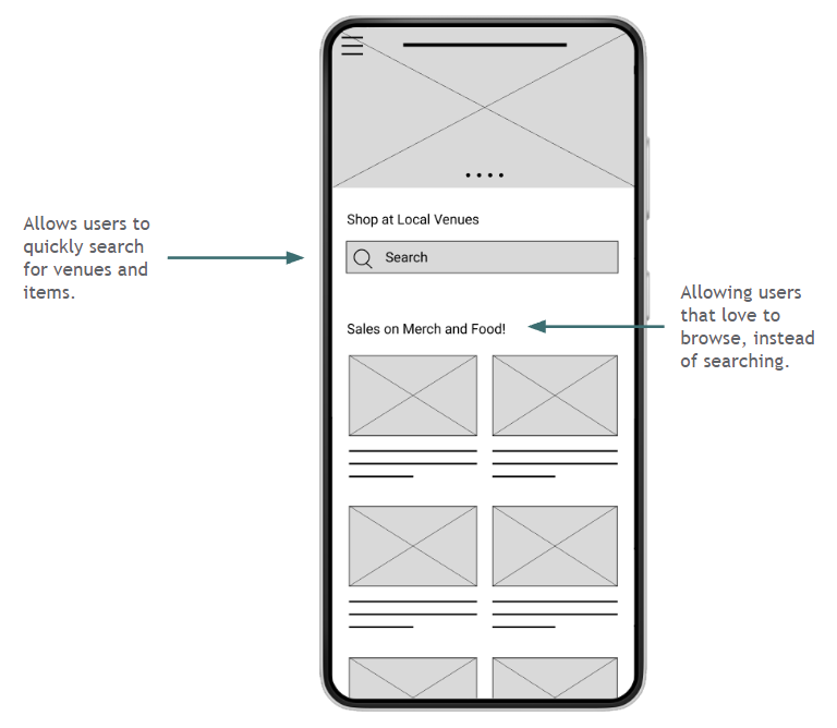
- I’ve made it easier for users to find what they are looking for and being able to browse through sale items below it.
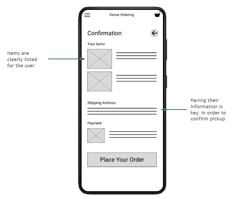
- Providing the user a confirmation screen was important to the purchasing flow. Listing items that they’re about to purchase and showing them their information was important to pick up their items.
1
2
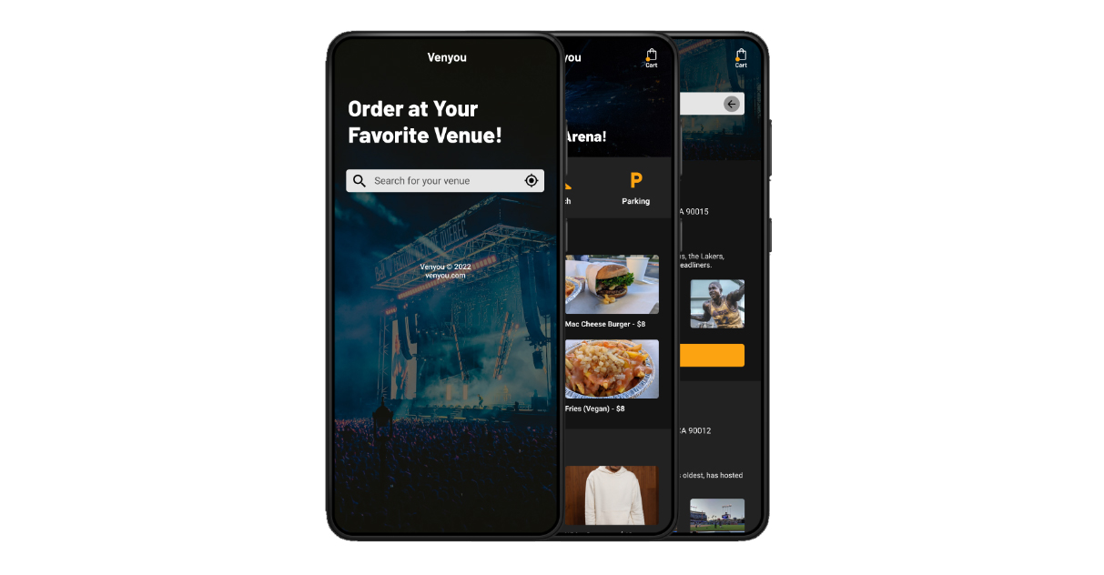
Low-fidelity Prototype
This lo-fi prototype emulates the user flow when ordering an item within the app.
View the: lo-fi prototype
Usability Studies
I’ve conducted two rounds of usability studies. Findings from the first study guided the process of wireframes to mockups. The second round helped guide the process from hi-fidelity prototype to refinements of our mockups.
Round 1 findings
- Users had issues being able to edit their credit card info.
- Users didn’t find the search bar useful
- Users were confused if inputs were selectable or not
Round 2 findings
- Users were using the category icons over the search bar
- Users liked the ability to see their amount in their shopping cart
- Users were confused with current and previous orders
Refining the Design
- Mockups
- High-fidelity Prototype
- Accessibility
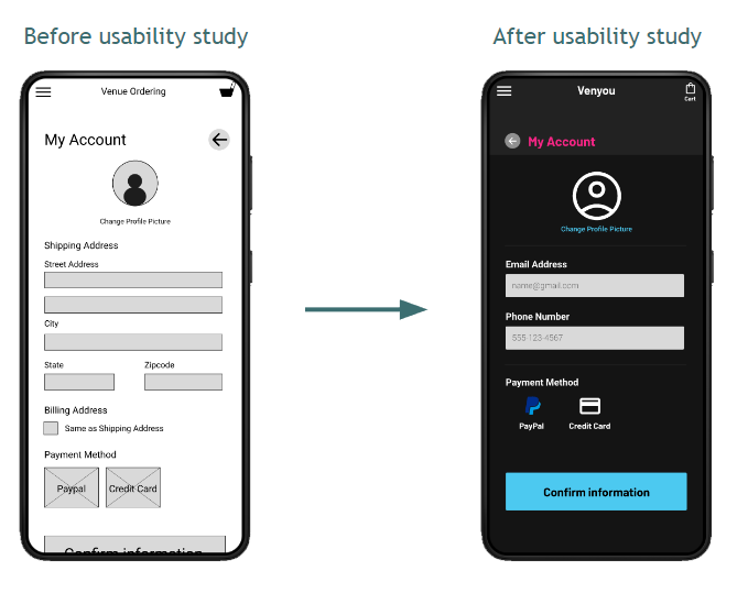
Mockups - First Round
Early designs had more information about the user but after the usability testing, I removed the mailing address. This information will not be collected by the company, so there wasn’t any need for having those fields.
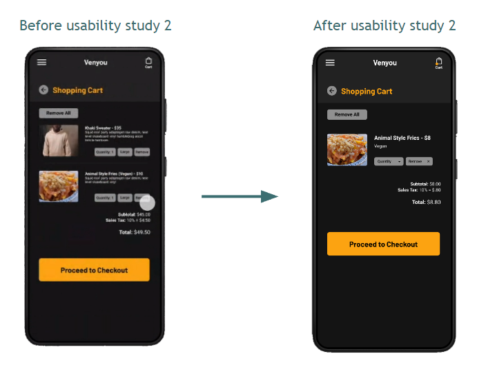
Mockups - Second Round
The second usability study revealed that users were confused why there was an extra item in the shopping cart. So I’ve removed the extra item and removed elements that weren’t necessary for the user.
Mockups
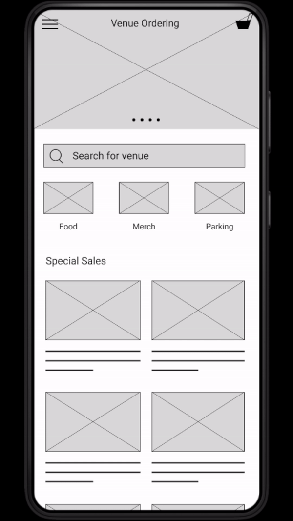
High-fidelity Prototype
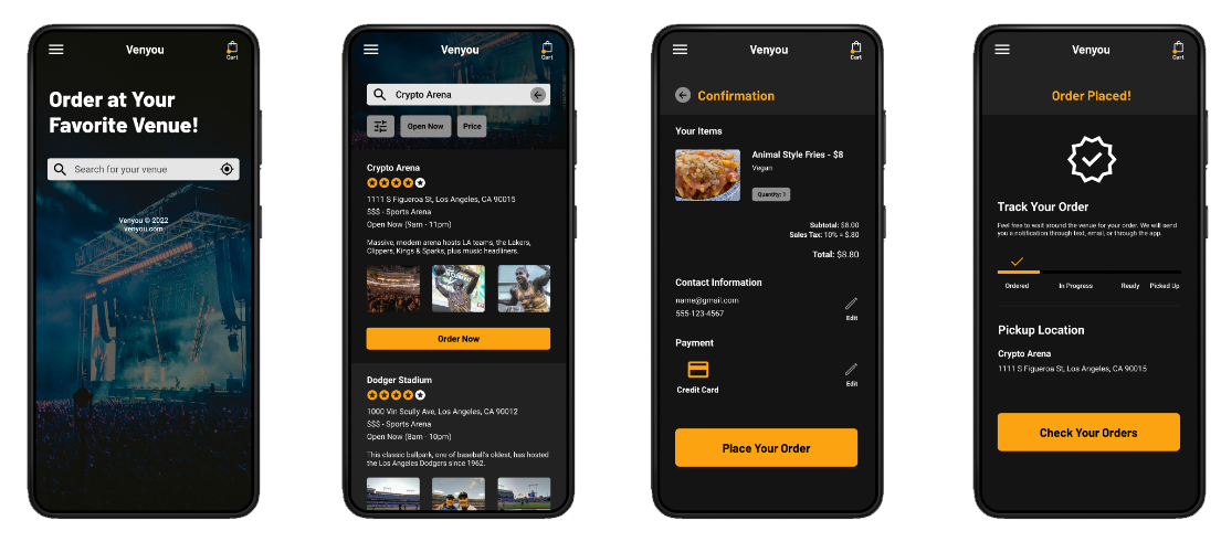
This prototype represents a better user flow for ordering an item. I’ve also given the user the ability to browse instead of search. It also accomplishes user’s wants by having sale items at the home screen.
Accessibility Considerations
1
Contrast
Colors that were chosen were run through a contrast test. This allows for readability at any given situation.
2
Animations
App has the appropriate amount of animations that guide the user through the flow of ordering an item.
3
Screen Readers
Most icons are given descriptive text below them, to help screen reader users understand which icons are helpful in their ordering process.
Going Forward
- Takeaways
- Next Steps
Takeaways
Impact
This app makes users feel comfortable by really thinking about the user’s needs.
One quote from peer feedback:
“I'm not good at social interaction… that's why I usually don't order things at the venue. I like how you can order something within the app and just pick it up and having to talk to so many people.”
What I Learned
While designing the Venyou app, I’ve learned that having usability studies makes a huge impact on making the project about the user. Meeting the user’s needs and getting feedback influenced each iteration of the app’s designs.
Next Steps
1
More Usability Testing
Conduct another round of usability studies to make sure that we’ve addressed all the pain points from the users.
2
Functionality and Accessibility
Add functionality to elements that haven’t been addressed yet.
3
New Features
Brainstorm new features that can be added within the app.
Thanks for reading the case study!
Thank you or your time for reviewing my work on the Venyou app! If you’d like to see more work or keep in touch, my contact information is down below.