popcorn
Project Overview
The Product
popcorn is a website for customers that want to place an order concession items, tickets, and parking at their local movie theater. popcorn offers deals and hot items at the theater that they have selected. popcorn targets teenagers that frequently watch movies at the theater and are low income.
Project duration
October 2022 - November 2022
The Problem
Users having to wait in a long line at the concession stand. Especially when they’re rushing to go see their movie.
The Goal
Designing a website for users to order concession stand items efficiently. Giving them the ability to track their order and pick up their concession items.
My Role
UX Designer and Researcher. Designed the website and experience for popcorn from conception to delivery.
Responsibilities
Conducting user research, paper and digital wireframing, low and hi fidelity prototyping, conducting usability testing, iterating on designs, and accounting for the user.
Understanding the User
- User Research
- Personas
- Problem Statements
- User Journey Maps
User Research - Summary
I conducted interviews and created empathy maps to understand users that I’m designing for and their needs. A primary user group that I identified with research was working college students who want to order concession items, in advance, before arriving to the theater.
This user group confirmed assumptions of movie theater customers, but research also revealed that not only ordering was the main factor. Other user problems included wanting to order tickets and parking, disability considerations, or financial problems that can make it difficult to complete the experience.
User Research - Pain Points
1
Financial
Working young adults aren’t always financially stable to purchase full priced items.
2
Accessibility
Platforms for ordering food are not always equipped with assistive technologies like contrast tools, wheelchair access or language options.
3
Inventory
Not having all the items listed on the website and to give the user the ability to purchase exactly what they want.
4
Easibility
Having to fight crowds to order something simple through a website in advance.
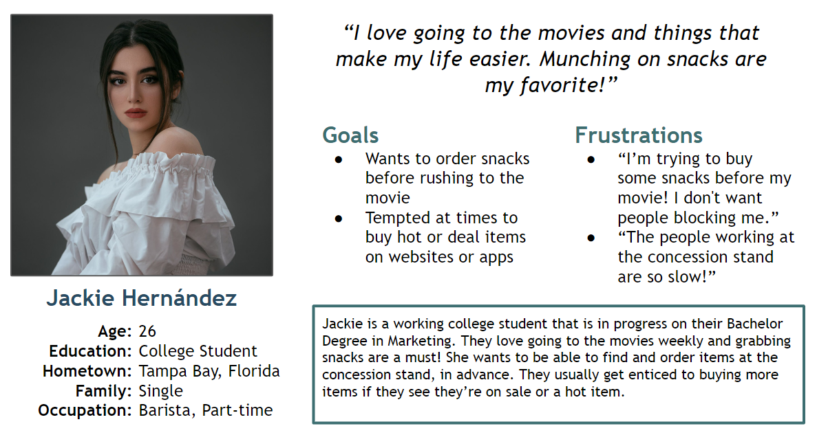
Personas - Jackie
Problem Statement
Jackie is a busy working college student who needs to order popcorn, in advance, because they’re running late to their movie.
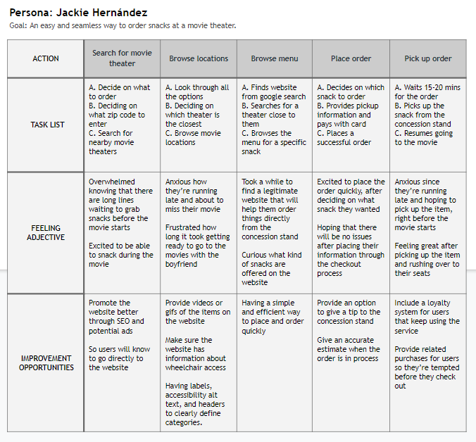
User Journey Map
Creating the journey for Jackie allowed us to understand how useful the popcorn website can be for a user like her.
Starting the Design
- Paper Wireframes
- Digital Wireframes
- Low-fidelity Prototype
- Usability Studies
Paper Wireframes
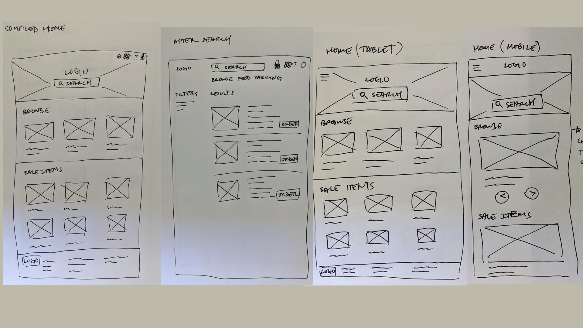
Crafted many paper wireframes to take into account for the user’s wants and pain points. For the home screen, I’ve prioritized having search and browsable options above the fold.
Digital Wireframes
- Made it easier for users to find what they are looking for with search and browseable options.
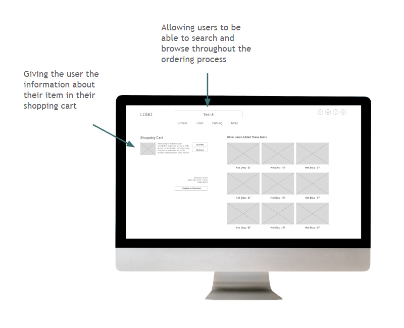
- Providing the user a detailed list of items that the user has added to their cart. Having related items added to their carts is another useful feature, so it’ll help people remember to add things to their cart.
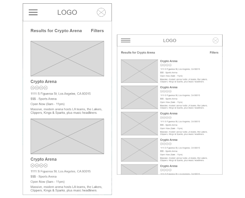
- Here are the wireframes for the mobile and tablet layouts, when a user searches for an venue.
1
2
3
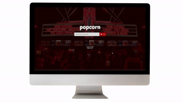
Low-fidelity Prototype
This lo-fi prototype emulates the user flow when ordering an item within the desktop website.
View the: lo-fi prototype
Usability Studies
I’ve conducted two rounds of usability studies. Findings from the first study guided the process of wireframes to mockups. The second round helped guide the process from hi-fidelity prototype to refinements of our mockups.
Round 1 findings
- Users had issues being able to edit their credit card info.
- Users didn’t find the search bar useful
- Users were confused if inputs were selectable or not
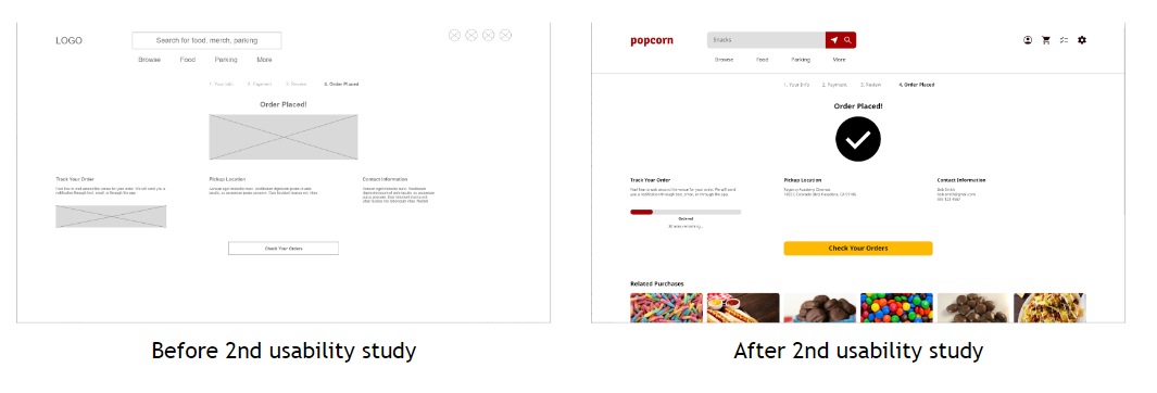
Round 2 findings
- Users were using the category icons over the search bar
- Users liked the ability to see their amount in their shopping cart
- Users were confused with current and previous orders
Refining the Design
- Mockups
- High-fidelity Prototype
- Accessibility
Mockups - First Round
Early designs had a version of the quantity and remove option but after the usability testing, I decided to consolidate the icons. Users were not using the options plus it’s streamlining the options.
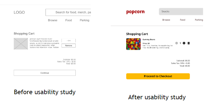
Mockups - Second Round
The second usability study revealed that users were completing the ordering process very quickly. So I’ve created related purchases for the user. So the user might be tempted on ordering more items for their next order.
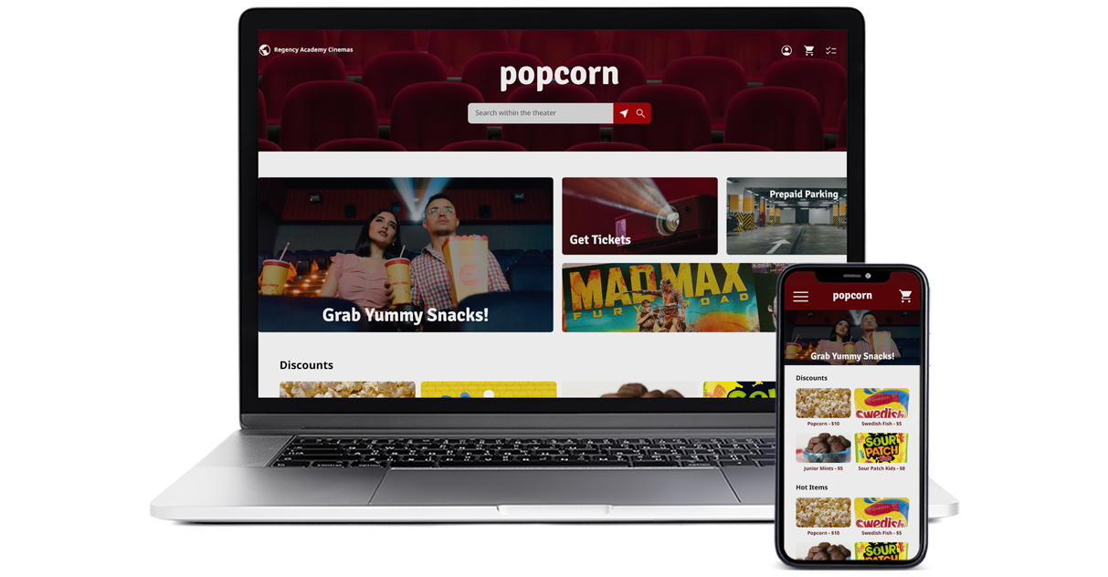
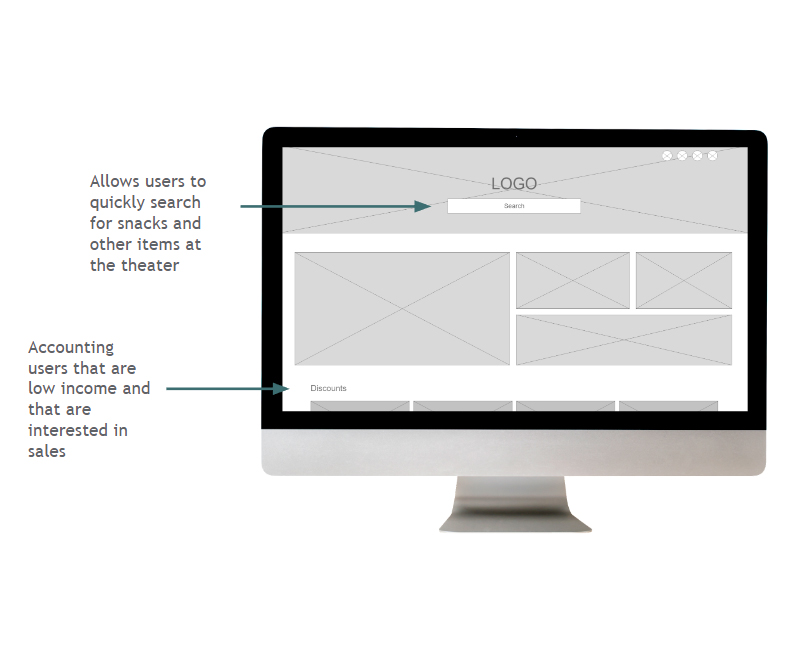
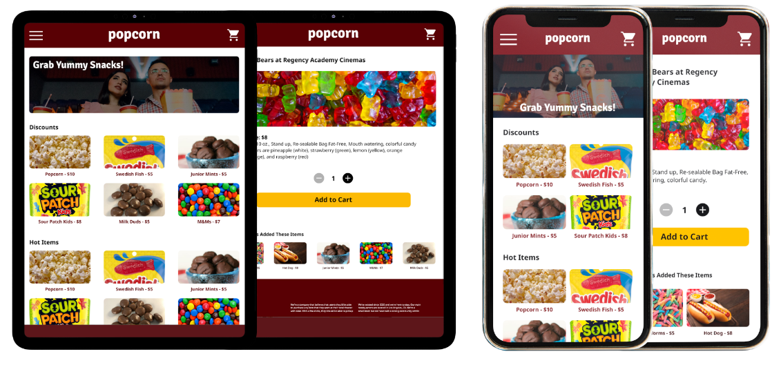
Mockups - Desktop
Mockups - Tablet and Mobile
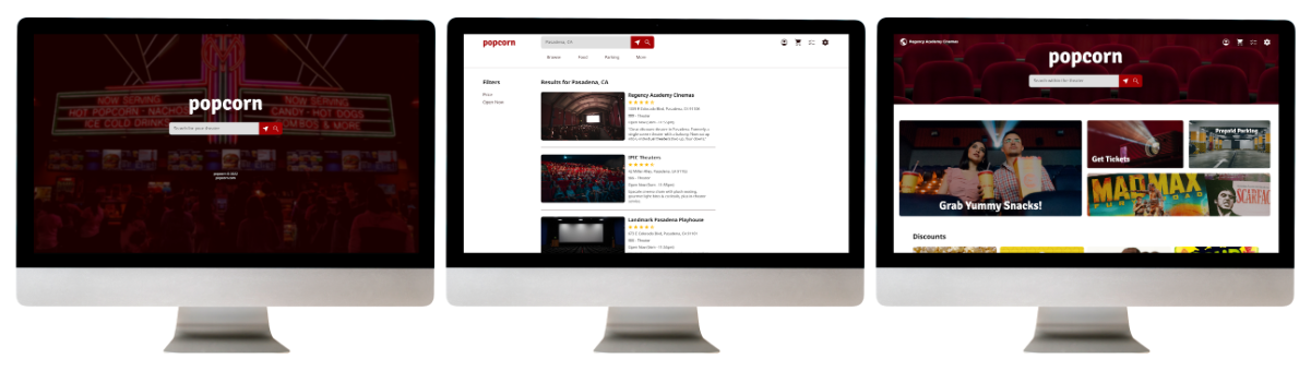
High-fidelity Prototype
This prototype represents a better user flow for ordering an item. Having a dedicated shopping cart shown throughout the ordering process helps continuity for users. It also accomplishes user’s wants by having hot/sale items at the home screen.
Accessibility Considerations
1
Contrast
Colors that were chosen were run through a contrast test. This allows for readability at any given situation.
2
Shopping Cart
The website has a shopping cart shown that guides the user through the flow of ordering an item.
3
Screen Readers
All pages have headers and labels, to help screen reader users understand which icons and titles are helpful.
Going Forward
- Takeaways
- Next Steps
Takeaways
Impact
This website makes users feel comfortable using the service by understanding the user’s needs.
One quote from peer feedback:
“I’m always in a rush when I go to the movies, so having this website before I head to the theater is great!”
What I Learned
While designing the popcorn website, I’ve learned that having accessibility features and making a seamless ordering flow is important. Meeting the user’s needs and getting feedback influenced each iteration of the app’s designs.
Next Steps
1
More Usability Testing
Conduct another round of usability studies to make sure that we’ve addressed most of the pain points from the users.
2
Functionality and Accessibility
Add functionality and more accessibility to elements that haven’t been addressed yet.
3
New Features
Brainstorm new features that can be added within the website.
Thanks for reading the case study!
Thank you or your time for reviewing my work on the popcorn responsive website! If you’d like to see more work or keep in touch, my contact information is down below.