Knowledge
Project Overview
The Product
Knowledge is a mobile app and website for users that want to advance their technical knowledge. Knowledge offers courses for users to take, gain certification for completion, and contact instructors. Knowledge is targeting users that want to gain technical skills for their careers, while on the job.
Project duration
December 2022 - February 2023
The Problem
Users that want to gain certification and skills for their job or to land a future job.
The Goal
Designing a mobile app and responsive website for users that want to learn technical skills. Giving them the ability to contact the instructor while they’re taking the course.
My Role
UX Designer and Researcher. Designed the mobile app, website, and experience for Knowledge from conception to delivery.
Responsibilities
Conducting user research, paper and digital wireframing, low and hi fidelity prototyping, conducting usability testing, iterating on designs, and accounting for the user.
Understanding the User
- User Research
- Personas
- Problem Statements
- User Journey Maps
User Research - Summary
I conducted interviews and created empathy maps to understand users that I’m designing for and their needs. A primary user group that I identified with research was working employees that want to advance their technical skills, for their career.
This user group confirmed assumptions of employees, but research also revealed that not only watching videos was the main factor. Other user problems included wanting to contact the instructor, having live subtitles, and being able to purchase the course quickly that can make it difficult to complete the experience.
User Research - Pain Points
1
Time
Working adults don’t have a lot of time at work to train themselves.
2
Accessibility
Competitors don’t have tools like live captions or subtitles on their videos. Having the ability to change the speed of the video is important too.
3
Contact
Not being able to contact the instructor directly. Competitors give the ability to message or email the instructor, but not message directly.
4
Learning
Not having the ability to learn at their own pace. Having a live instructor doesn’t allow for that.
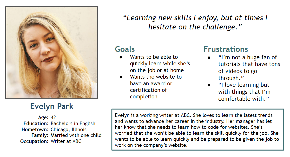
Personas - Evelyn
Problem Statement
Evelyn is a busy employee who wants to learn technical skills because they want to improve their chances of advancing their career.
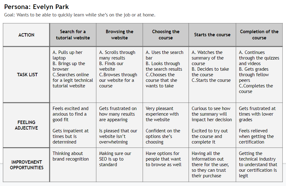
User Journey Map
Creating the journey for Evelyn allowed us to understand how useful the knowledge app and website can be for a user like her.
Starting the Design
- Paper Wireframes
- Digital Wireframes
- Low-fidelity Prototype
- Usability Studies
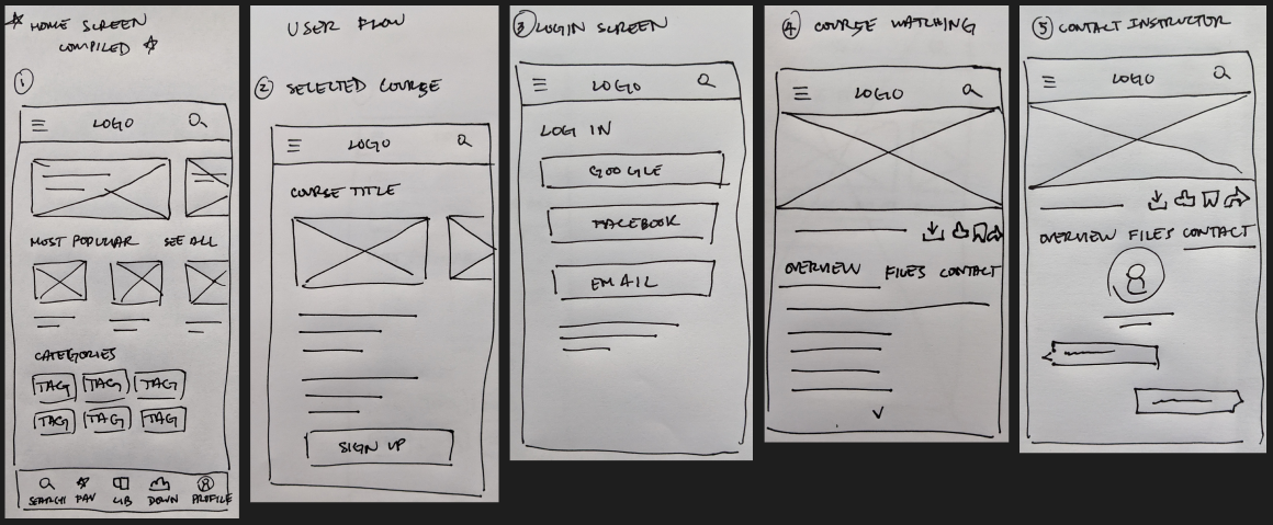
Paper Wireframes
Crafted many paper wireframes to take into account for the user’s wants and pain points. For the home screen, I’ve prioritized having browseable elements and giving the user the ability to search.
Digital Wireframes
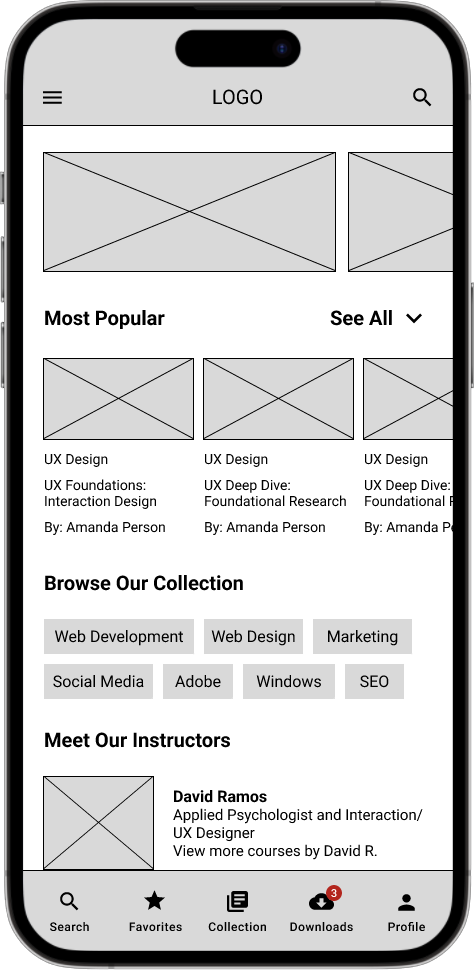
- Made it easier for users to find what they are looking for with search and browseable options.
- Providing the user the ability to message the instructor while they’re taking the course. Most competitors don’t have that option. Being able to download files, like the video, and to download the course for offline viewing are available.
1
2
Low-fidelity Prototype
This lo-fi prototype emulates the user flow when viewing a course and chatting with an instructor.
View the: lo-fi prototype
Usability Studies
I’ve conducted two rounds of usability studies. Findings from the first study guided the process of wireframes to mockups. The second round helped guide the process from hi-fidelity prototype to refinements of our mockups.
Round 1 findings
- Users were confused on why there wasn’t a confirmation screen
- Users wanted the instructor information formatted differently
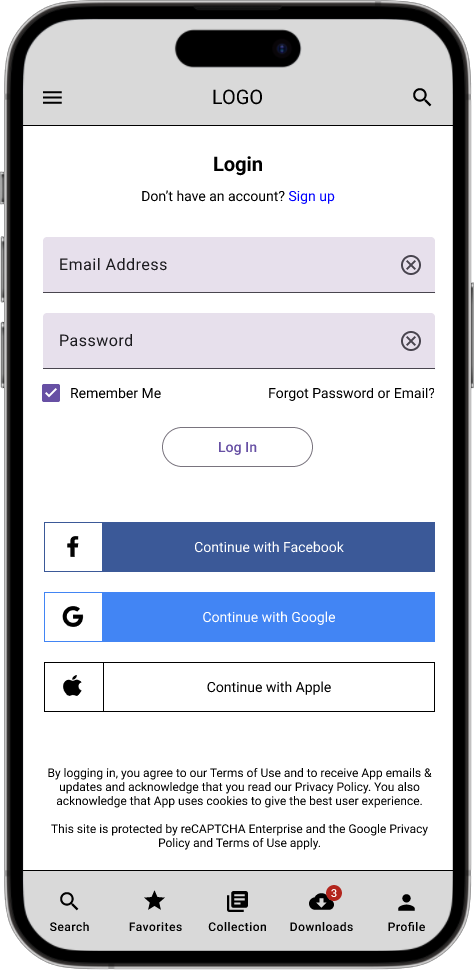
- Users suggested to change the wording on the login
Round 2 findings
- Users were inclined on browsing, instead of searching for a course
- Users enjoyed how easy it was to contact the instructor
- Users enjoyed the content about the example course
Refining the Design
- Mockups
- High-fidelity Prototype
- Accessibility
Mockups - First Round
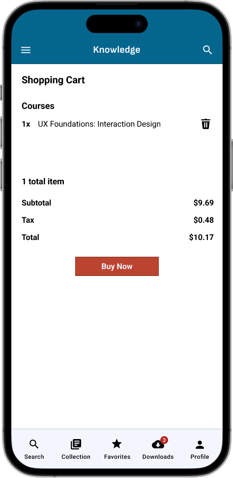
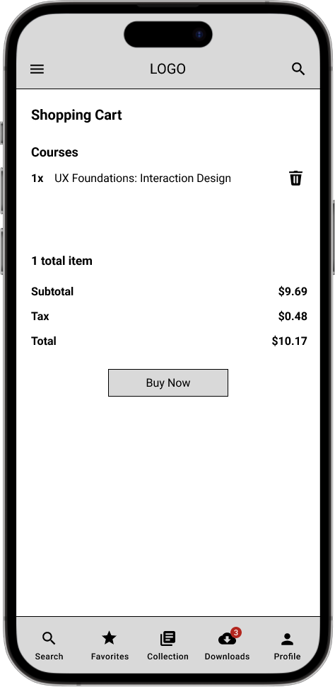
Early designs had a version of the login screen without a shopping cart screen but after the usability testing, I decided to add a shopping cart screen. Users were confused on why there wasn’t a screen to see which course they’re purchasing.
Mockups - Second Round
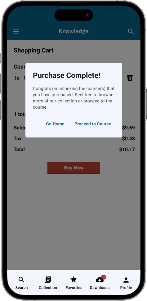
The second usability study revealed that users were weren’t given a confirmation when they purchased their course. So I’ve created a purchase pop up for the user. So the user is given the ability to go home or proceed to the course, that they purchased.
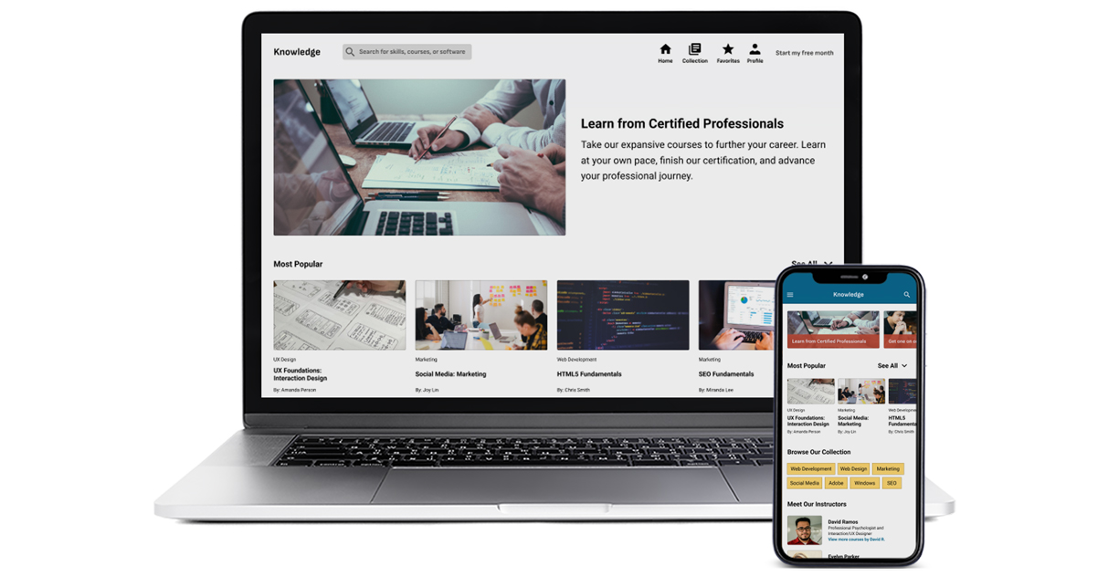
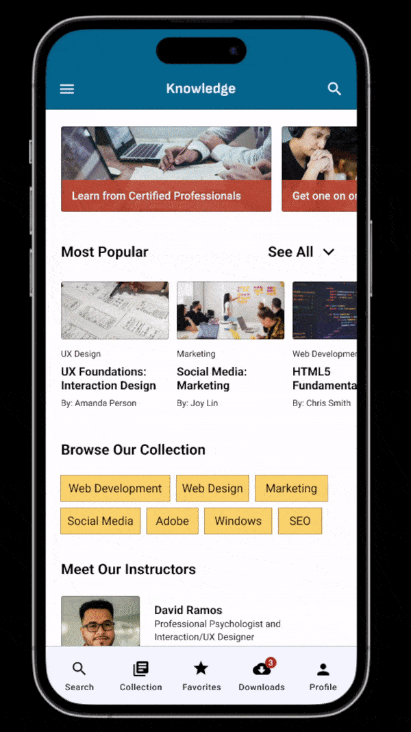
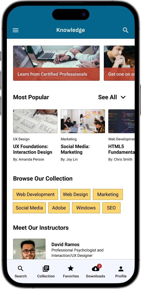
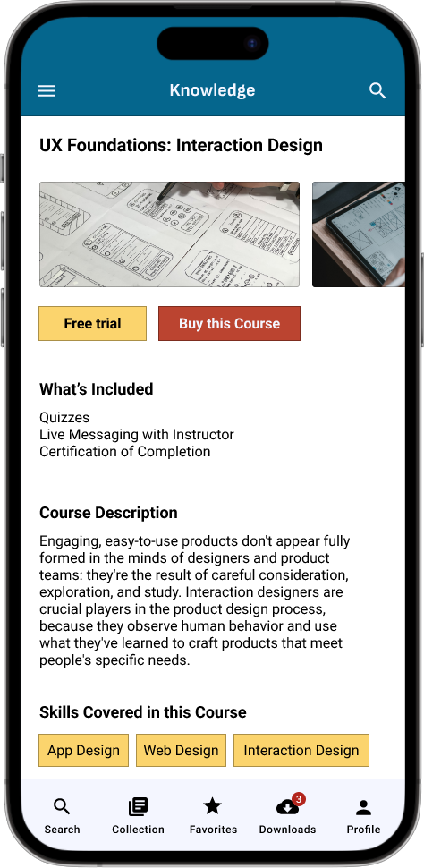
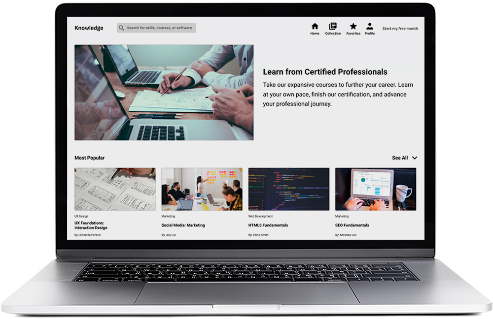
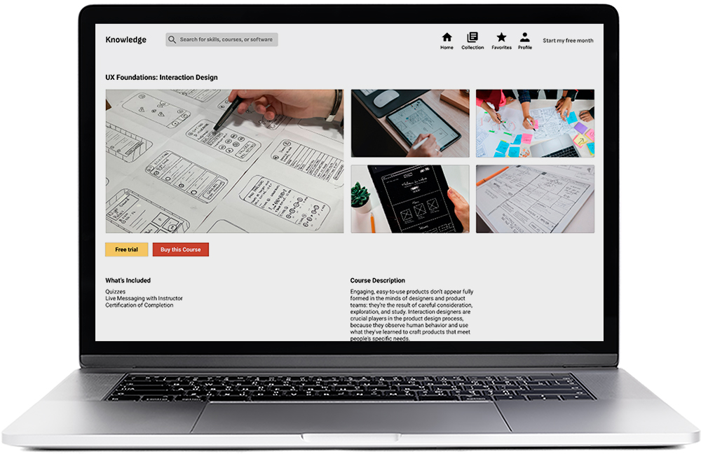
Mockups - Mobile App
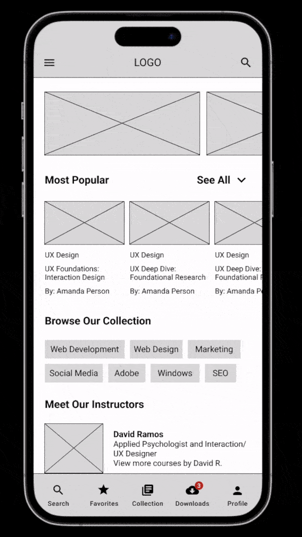
Mockups - Tablet Website (Responsive Design)
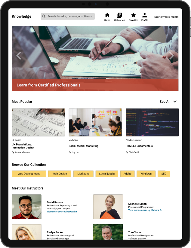
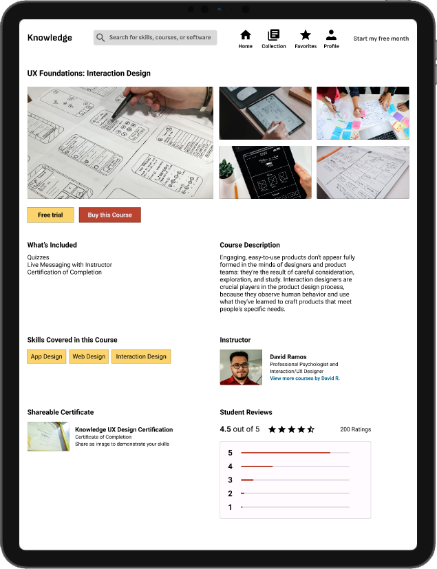
Mockups - Desktop Website (Responsive Design)
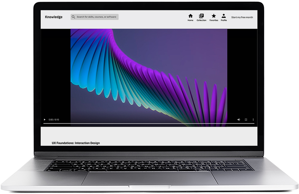
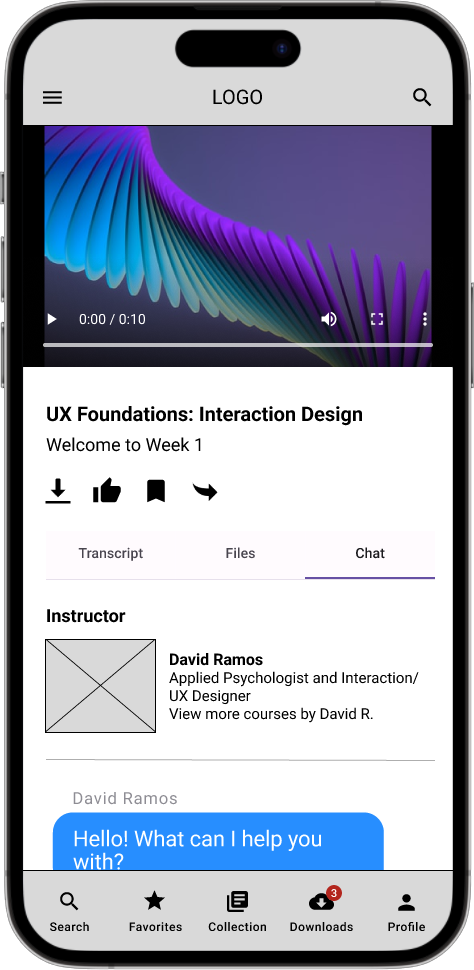
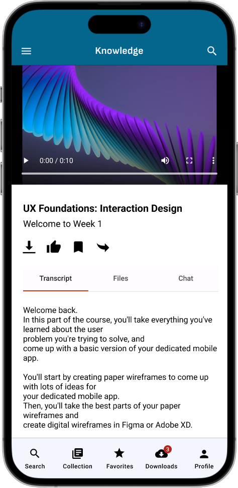
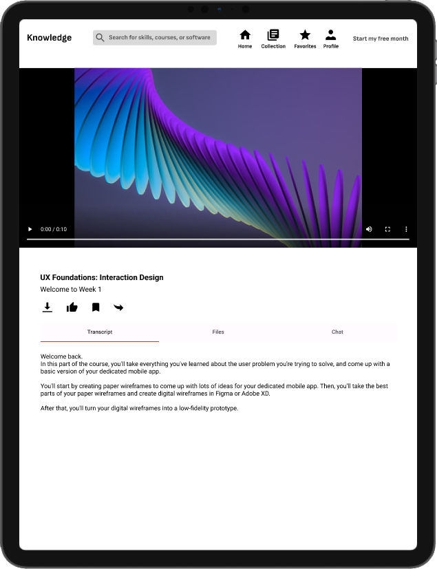
High-fidelity Prototype
This prototype represents a better user flow for ordering a video course and chatting with the instructor. Giving the user the ability to download files, read transcripts, and find the instructors they want are core features. It also accomplishes user’s wants by having a streamlined experience to watch and complete course videos.
Accessibility Considerations
1
Contrast
Colors that were chosen were run through a contrast test. This allows for readability at any given situation.
2
Iconography
All iconography used on the website and app have text to explain what each element does.
3
Screen Readers
All pages have headers and labels, to help screen reader users understand which icons and titles are helpful.
Going Forward
- Takeaways
- Next Steps
Takeaways
Impact
This responsive website and companion app makes users feel comfortable using the service by understanding the user’s needs.
One quote from peer feedback:
“I think this has potential to become a great app and website.”
What I Learned
While designing the knowledge website and mobile app, I’ve learned that having accessibility features and making a seamless ordering flow is important. Meeting the user’s needs and getting feedback influenced each iteration of the app’s designs.
Next Steps
1
More Usability Testing
Conduct another round of usability studies to make sure that we’ve addressed most of the pain points from the users.
2
Functionality and Accessibility
Add functionality and more accessibility to elements that haven’t been addressed yet.
3
New Features
Brainstorm new features that can be added within the website.
Thanks for reading the case study!
Thank you or your time for reviewing my work on the Knowledge responsive website and mobile app! If you’d like to see more work or keep in touch, my contact information is down below.